http://www.avert.org/usa-statistics.htm
This is a pie chart to represent the proportion of the male and female populations and how they contracted HIV.
Map Catalog 2011
Tuesday, November 22, 2011
Highway map of US
http://www.onlineatlas.us/interstate-highways.htm
This is a planimetric map of the United States, with the different states identified by different colors. The interstate highways are featured on this map.
This is a planimetric map of the United States, with the different states identified by different colors. The interstate highways are featured on this map.
Frequency distribution
http://www.psychstat.missouristate.edu/introbook/sbk07.htm
This is a frequency distribution plot. This shows the count for different events that happened. In this plot the categories are nominal and show the amount of times an event occurred. If you were to add the total number of events and divide each category by the amount of times it occurred in that category, you would have the relative frequency for each category.
This is a frequency distribution plot. This shows the count for different events that happened. In this plot the categories are nominal and show the amount of times an event occurred. If you were to add the total number of events and divide each category by the amount of times it occurred in that category, you would have the relative frequency for each category.
Parallel Coordinates
http://www.juiceanalytics.com/writing/parallel-coordinates/
This is a map of parallel coordinates. This is an example of automobiles, where there are many variables to determine the performance of a car. Each of the vertical axis represents the range of values for a parameter. These include number of cylinders, displacement, weight, horsepower, acceleration, mpg, year and origin. It would be ideal to have a car which performs great in each category, but there are always compromises, cut the performance in one aspect to boost the performance in another. This chart helps illustrate the differences.
This is a map of parallel coordinates. This is an example of automobiles, where there are many variables to determine the performance of a car. Each of the vertical axis represents the range of values for a parameter. These include number of cylinders, displacement, weight, horsepower, acceleration, mpg, year and origin. It would be ideal to have a car which performs great in each category, but there are always compromises, cut the performance in one aspect to boost the performance in another. This chart helps illustrate the differences.
Correlation matrix
http://www.inductive.com/help-doc-correl.htm
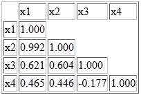
This is a correlation matrix. All of the variables are listed on both the x and the y axis. This provides a way to show a combination of each of the variables and list their independent correlation. Each variable is perfectly correlated with itself because they have the same variation. The other correlations are less than 1 or greater than -1 because that is the scale of a correlation.
This is a correlation matrix. All of the variables are listed on both the x and the y axis. This provides a way to show a combination of each of the variables and list their independent correlation. Each variable is perfectly correlated with itself because they have the same variation. The other correlations are less than 1 or greater than -1 because that is the scale of a correlation.
Starplot for car analysis
http://itl.nist.gov/div898/handbook/eda/section3/starplot.htm
This is a starplot. Each of the axis represents a something to measure about the subject. In this car example, the axis represent price, mpg rating, repair rates, headroom, rear seat room, trunk space, weight, and length. By having multiple axis, the plot is able to communicate a lot of information about the car, and the user is able to compare a lot of features among many cars easily. For example, it seems that many of the cars sacrifice great mileage to have other features like headroom, rear seat room, trunk space, weight and length.
This is a starplot. Each of the axis represents a something to measure about the subject. In this car example, the axis represent price, mpg rating, repair rates, headroom, rear seat room, trunk space, weight, and length. By having multiple axis, the plot is able to communicate a lot of information about the car, and the user is able to compare a lot of features among many cars easily. For example, it seems that many of the cars sacrifice great mileage to have other features like headroom, rear seat room, trunk space, weight and length.
Subscribe to:
Comments (Atom)


